NEX Logo Design
NEX is a brand concept where I explored a bold, cinematic aesthetic through a focused design process. Starting with research into visual tone and identity, I translated ideas into rough sketches, experimenting with type, layout, and mark making. The typeface or logo font was created manually. From there, I refined the strongest concepts digitally tweaking balance, spacing, and form until the final logo felt functional and distinctive. This project visually presents the final results.
LOGO Champion
Initially, I experimented with different reough sketches of the logo in different styles, changing the marker type using thinner strokes and on different type of paper.
Finally the logo below was chosen and finalized as well as animated.
Casino Logo
This casino logo was created as part of a YouTube video project, with the goal of crafting something bold, eye catching, and full of character. The design went through several rounds of experimentation to strike the right balance of shine, dimension, and visual impact. With its glowing elements, rich gold tones, and playful casino motifs, the final result captures the glitz and energy of classic gambling cultureand absolutely delivered on the intended vision.
Casino logo 2
This is a sequel to the original casino logo, also created as part of a YouTube video project. Designed using a different software, it naturally took on a distinct style and feel offering a fresh visual take while still echoing the bold, vibrant spirit of the original. The contrast between the two logos highlights the flexibility of the design process and how tools can shape both form and expression
Arcade logo
This project features a beautifully designed arcade logo created to capture the vibrant essence of classic retro gaming culture. The goal was to evoke nostalgia while keeping the design bold, clean, and visually striking for modern use. Inspired by the neon lights, pixel art, and energetic aesthetics of 80s and 90s arcades, the logo blends vintage charm with a contemporary twist.
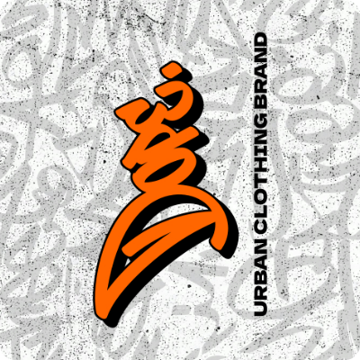
Full Branding
Dope is an urban clothing brand built on a design philosophy that celebrates individuality, rebellion, and confidence. Every element from typography to fabric selection is intentionally crafted to reflect the raw, unfiltered energy of street culture.
The visual identity of Dope leans into contrast: clean silhouettes paired with bold graphics, muted palettes interrupted by sudden bursts of statement color, and structured pieces softened by effortless styling. It’s a balance of refinement and edge designed for self-expression without compromise.
Dope isn’t about following trends. It’s about creating pieces that become statements clothing that empowers the wearer to take up space and own their narrative. From garment cuts to logo placement, everything is considered through the lens of attitude, movement, and cultural relevance.
Designed for those who challenge norms and lead with authenticity, Dope is more than streetwear it’s visual armor for the modern misfit. Each drop carries a clear message: stand out, stay bold, and never water it down.
The rest can be expalained below with visuals rather than words.